
This is another article in a series of education posts from Alan Hull. Alan Hull is a renowned technical analyst within the Australian Market. He has educated thousands of investors on how to apply technical analysis within their overall strategy. In this special series, Alan has agreed to share his Technical Analysis tutorials with Stockopedia members. He has committed to provide one ever three/four weeks. To learn more about Alan you can read his profile here. Or visit his website alanhull.com.au
To re-acquaint yourself with Alan’s prior postings, please go to “Discuss” in the left hand column and selecting “Aus/NZBlogs” (see below). Scroll down and you will find a contribution one to every three/four weeks. All graphs are for education purposes only and are deliberately out of date for that reason.

Other important patterns
Line of best fit
If a group of traders and investors believed $7.50 is the true value for a share then it is logical to assume that they would be buyers if the price fell below $7.50. Conversely, if the price rose above $7.50 they would become sellers. This causes the share price to return to $7.50 whenever it tries to move away from this level.
A horizontal line at $7.50 is called the line of best fit or line of linear regression. A line of best fit is similar to a support and resistance line but of different significance. As the volatility of price activity diminishes and settles at the line of best fit, agreement is being reached by the bulls and bears.
From this point there will be a breakout and the chartist will use other indicators and methods to determine the direction of the breakout. If the price activity remains around the line of best fit for a prolonged period, the price will develop support and resistance characteristics as well.
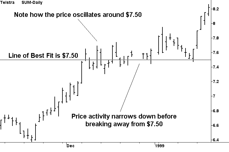
The above historical chart of Telstra shows the price activity oscillating around $7.50 in late 1999 and how this price activity gradually narrowed down before breaking away from $7.50. Furthermore, towards the right hand side of the chart, the price activity comes down and bounces off $7.50 before continuing on its upward trend. Because the price has remained at this level for some time, it developed support/resistance characteristics as well.
Lines of best…

Already have an account?
Login here


