Everyone has a favourite video game tutorial. Maybe it’s the first hour of Fallout 3, which quite literally treats you as a baby, teaching you new mechanics at different stages of growth? Perhaps it’s Half-Life 2’s iconic tutorial that packs everything you need to know into four words and one empty can of soda?
Whether you feel developers’ fingerprints at the start of your virtual journey or not, tutorials are an essential part of the experience. While a well-crafted tutorial can leave players hungry for more, one with less thought put into it might diminish the chances of them ever returning.
There are many tried and tested ways to onboard players into new experiences, yet some are more memorable and effective than others. To uncover the key ingredients and design principles behind compelling tutorials, we spoke with several game designers who were happy to share their insights.
Spacing and pacing
Depending on the mileage of your gaming and tutorial-design experience, you might know that there’s no one-fits-all framework for crafting a perfect tutorial. Rather, it all relies on the genre and complexity of your game.
Studio MDHR’s Cuphead, for example, packs everything the player needs to know in order to finish the game in a tightly-crafted, snack-sized tutorial level. And yet, the same onboarding approach wouldn’t work for more atypical titles such as Chants of Sennaar or Kerbal Space Program, because it would simply end up being too overwhelming.

“There’s always this fear of [players] thinking, ‘This is the level of guidance I can expect from this game.’ Have them understand that the tutorial is over and now you’re on your own
Dana Nightingale, Arkane Lyon
As the campaign designer responsible for easing players into Deathloop, a game that introduced a time-loop mechanic to Arkane Lyon’s celebrated immersive sims catalogue, Dana Nightingale ran into this conundrum as well. The solution, as she explains, was to break new information down and drip-feed it to players.
“We had to space things out and really dedicate curated moments to individual mechanics, and do that retroactively. We discovered we had to do [that] because we had so many mechanics that we just kind of felt like, ‘It’s fine. Let’s let the player figure it out’. This turned out not to be a strategy that was helpful in a game with this many new, unfamiliar mechanics.”
To onboard both experienced and new players into their brand new title, Nightingale and her team dedicated the first two levels of the game, ‘The Longest Day’ and ‘Ubiquity’, to introduce players to the tools and mechanics needed to enjoy this immersive simulator. However, there were a couple of mechanics – one of them being Infusion, which allows players to retain weapons and powers when the time loop resets – that players had a difficult time wrapping their heads around.
“We had to do something the studio’s never done before, which was to have tutorialized menus,” she explains. “[It’s] that layer on the interface that greys out the UI except for one element with a message explaining the player [that] we have a mechanic we want to introduce you to. ‘This is what it’s for, here’s how you skip time periods, how you use this widget to progress the time.’ Once we got there in terms of the ideology of ‘Oh, maybe we do actually need tutorials in our UI,’ we immediately saw that it worked. Then we added a bunch more.”
Similarly to Deathloop, Larian Studios’ Game of the Year-winning sequel, Baldur’s Gate 3, is also a game made from many interconnected mechanics. And when you are crafting an adventure for both regular Dungeon & Dragons players and people for whom this may be a gateway into role-playing, avoiding a sense of information overload is key.
“The game is big, and it may feel like it’s a lot to learn,” Anna Guxens, senior RPG/narrative designer at Larian Studios, tells GamesIndustry.biz. “We focused on starting simple, with just a handful of available actions and a constrained level to start easing players into the game, and then adding reactive messages whenever they encountered something new as their adventure progressed.”

Design the tutorial around the narrative (if possible)
Another important tenet of a great tutorial, as told by all the designers we spoke to for this article, is integrating it into the narrative of the game wherever possible.
While it may seem more cost-efficient to do with a couple of pop-up text-boxes and let players be on their way, Leo Dasso, the lead developer behind the upcoming hand-drawn twin-stick shooter Hauntii, argues that not this approach not only breaks the immersion, it can also be a missed opportunity.

“If you know the sequence of things you need to teach, you can basically create a level that teaches those things,” he explains.
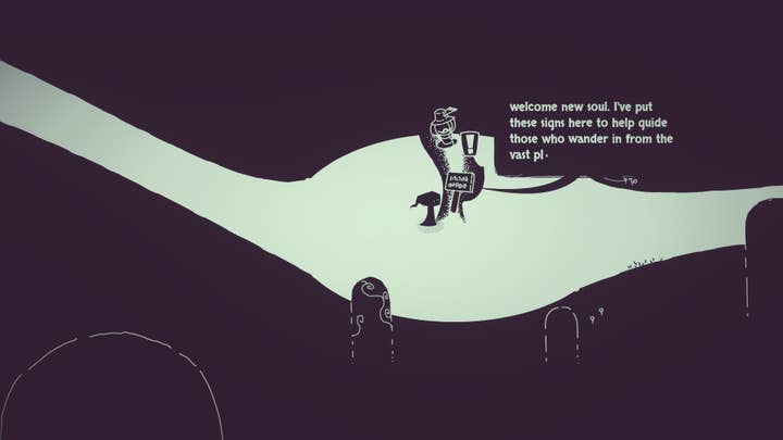
Like Deathloop, Dasso’s game puts a twist on the traditional twin-stick shooter formula by putting players in charge of a ghost that’s able to possess everything from trees to various creatures by shooting them. As a new soul of the Eternity, then, it’s only natural that you’re welcomed and guided by another friendly spirit that helps with that. As soon as you learn how to haunt things, the game seamlessly shows that each object allows for different interactions by asking you to move a colossal Olmec head. Not ten minutes into Hauntii’s demo, the friendly spirit bids you farewell, marking the end of the introduction – which, according to Nightingale, is also a tenet of a great tutorial.
“There’s always this fear of them taking the wrong lesson to think, ‘This is the level of guidance I can expect from this game.’ Then we stop giving that guidance and it’s a problem again,” she explains. “Have them understand that the tutorial is over and now you’re on your own.”
Another powerful example of narratively enhanced onboarding was demonstrated by Frictional Games’ latest entry in the Amnesia franchise, which handed players tools to fight back the lurking horrors for the first time in the series.
“A great tutorial is when it’s embedded into the narrative or the setting so that it doesn’t feel like something detached from the experience itself,” Fredrik Olsson, the creative lead of Amnesia: The Bunker, tells us.

“A great tutorial is when it’s embedded into the narrative or the setting so that it doesn’t feel like something detached from the experience itself”
Fredrik Olsson, Frictional Games
“When players go through The Bunker, they get information in the [World War One] trenches,” Olsson explains. “We meet at the end of the trenches; you run and you encounter a locked door – you need to break it down. It’s part of what you naturally would do right now. So how do you do that? You then get some hints on how to pick things up and how to throw them at the door.”
By the time players escape the trenches, not only is the setting esablished, but they also understand how the gun and grenades work, and how to patch themselves up – as a real WWI soldier would.
However, the trenches is only the first half of The Bunker’s onboarding. The rest of it happens in The Central Bunker, which was the first area Olsson and his team designed for this project.
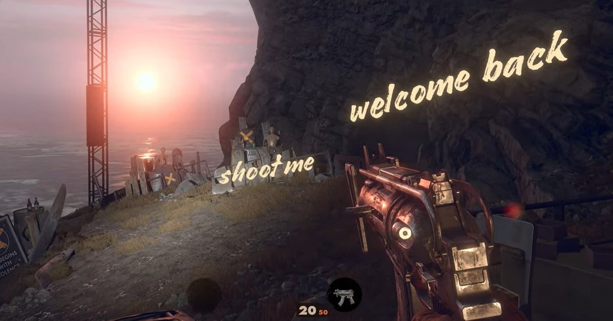
“Putting a sign on the wall next to the generator saying ‘The creature hates light’, as well as some other notes – those things were probably added later. But the basics, teaching the player that they can use the lamp to save progress, that they can use the storage box or that the generator affects the creature – those were planned very early because we made the Hub level first.”
Leave some room for discovery – and reward it!
Of course, if you look back at games like The Legend of Zelda: Breath of the Wild, there are plenty of things that the game doesn’t teach you right away. Rather, it leaves room for experimentation and surprises: when you get hit by lighting the first time, for example, there’s no mini-tutorial explaining why it happened or how it might be used. But when the player figures out that same electricity can be used to solve puzzles with your iron sword between two electrical switches as the conductor, it’s a rather feeling of empowerment – one that was always in mind when designing Baldur’s Gate 3.
“As a developer, you sometimes have to battle that dark urge to ensure players know everything you’ve added into the game”
Anna Guxens, Larian Studio
As Guxens explains: “As a developer, you sometimes have to battle that dark urge to ensure players know everything you’ve added into the game. However, there is a certain satisfaction to be found in discovering new exciting synergies and details: we allowed this space for discovery in Baldur’s Gate 3, layering elements of complexity for players to uncover on their own as they continue their adventure.”

While Baldur’s Gate 3 and Deathloop reward more curious players with better loot, the motivation developers can offer in other types of games differs. Titles like Amnesia: The Bunker reward players with additional pieces of the narrative, but would an extra bullet or two create the same feeling?
“Some people don’t know that you can use the bolt cutters on traps – when you do that, you disarm them,” Olsson says. “There is a photo in one of the levels in which you can clearly see a soldier cutting the wire – that’s also a tutorial, but that comes very late in the game.
“What we really wanted with The Bunker was to create a game that challenged the player; that made the player feel a lot of rewarding moments where they felt like they put the pieces together [themselves]. So we try to keep the tutorial station to a minimum, understanding what the player needs in order to finish the game. But we use these photos a lot as added bonuses to reward players that spend time taking in the story.”
Testing, refining and testing (again)
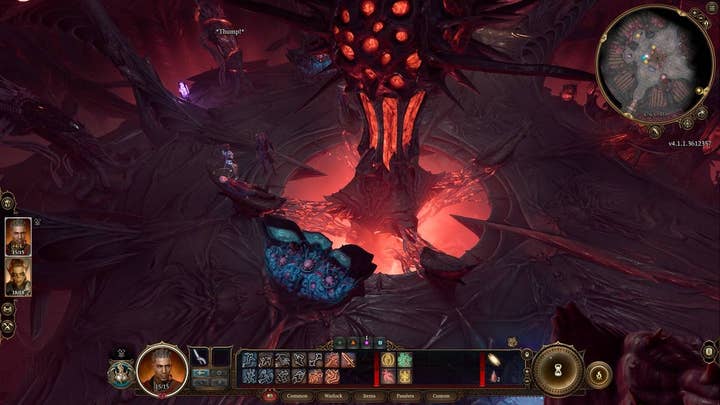
Everyone who followed Baldur’s Gate 3’s development since it first came out as an Early Access on Steam in 2020 can spot most tweaks that its tutorial section underwent before its official release date. The prologue level aboard The Mind Flayer Nautiloid, for example, was condensed and the early encounters were streamlined based on players’ feedback, Guxens explains. Although not every title decides to go the Early Access route, the principle remains the same: great tutorials do not happen without input from playtesters.
While the process of playtesting may be different depending on the target audience and scope of your project, most developers aim for their game to be played by everyone – and that includes people who don’t usually play video games or only do that on their phones. According to Dasso, those make for the best type of testers.

“If you can get somebody like that to get through the tutorial and understand the game – now that’s a big challenge,” he explains. “If you’re talking with someone who has some experience playing games and they more or less understand the genres, you can just hand them a controller and they’ll know what to do. But if you want to include people who really don’t usually touch games or at least play super casually, then you need to explain every little aspect about the genre and do it in a way that’s not boring.”
“If you know the sequence of things you need to teach, you can create a level that teaches those things”
Leo Dasso, Moonloop Games
Essentially, playtesting allows developers to see what works and what doesn’t. Or as Nightingale describes it, it’s a key component to problem-solving.
“It’s hard to understand what’s not understandable until you’re watching someone not understand it,” she laughs. “[If] we have ten players who are having trouble in this exact way, and five others who are having trouble in a completely different way – what’s the common thread here? [It’s a way to find] the thing that’s causing both of these problems to happen and try to solve it.”
Like most aspects of game development, designing an effective tutorial is a complicated endeavour involving numerous iterations and components. In the end, your game’s tutorial should always serve the same purpose: to equip the player with the tools for maximum immersion and enjoyment.
No matter how challenging and time-consuming it may seem, crafting a memorable tutorial is a one-time opportunity to show players that you care about them and want them to stick around until the very end – even if, as the popular adage goes, we make games primarily for ourselves.
More GamesIndustry.biz Academy guides to Making Games
Our guides to making games cover various aspects of the development process, whether you’re a young game developer about to start a new project or an industry veteran:


